Designing a real-time stress monitoring system for students
Designed a real-time stress monitoring system with the help of a wearable and a data visualising dashboard to proactively help students to mitigate their stress levels in classrooms.
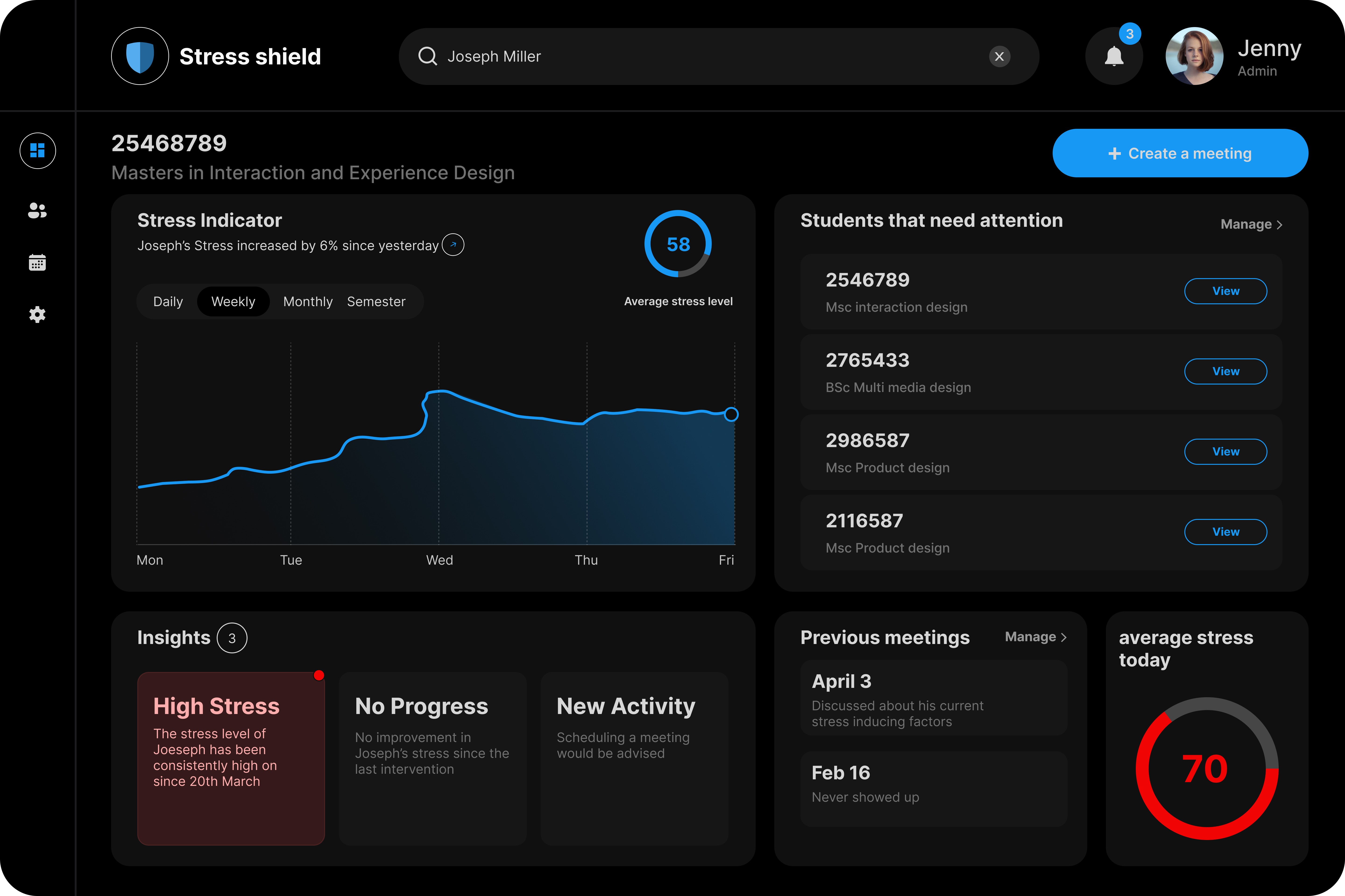
Dashboard
Academic Project
Workshop Facilitation
Background
Classroom stress goes undetected until it becomes a crisis. We designed a system to catch it in real time and discovered the hardest part wasn't the technology, it was figuring out who should actually be responsible for acting on it
This is a university module project exploring how technology could improve classroom wellbeing was designed using participatory methods with students, educators, and administrators.
Design Game to understand user needs
Rather than assuming what students needed, we built a card game to find out. Three sessions, 12 participants, role-playing as different stakeholders like educators, students, parents, administrators. The sessions generated more than 20 concepts. We picked one.

What the sessions produced
Three sessions, 12 participants, 20+ concepts sketched. Ideas ranged from AI tutors to mood-sensing classroom lighting. But one theme kept coming up across every group. Students felt their stress was invisible to everyone around them until it was already too late.
The one idea we chose
We picked up the stress monitoring concept not because it was the most technically exciting, but because it was the one where students felt most unheard. That felt like the right problem to design for.
The question we needed to answer
How might we develop a stress monitoring system that measures students stress levels in real-time, while ensuring ease of implementation and user comfort?
Creating the system
Our first instinct was straightforward. We thought that teachers were already in the room, so they should monitor the data and intervene directly.
Wrong assumption

But when we spoke to our professors, the cracks showed fast. Teachers were already stretched. Adding a health monitoring responsibility wouldn't just be impractical it would likely increase their stress too. We were designing a wellbeing tool that created a new wellbeing problem.

Assumption we had to kill after talking to teachers
The system didn't need a teacher. It needed a dedicated role, someone whose only job was to notice, refer, and support. That reframe changed everything downstream: the user, the dashboard, the data shown, and the privacy model.
Pivot - New system diagram
Once we redefined the role, the whole system became clearer. Here's how the pieces connect.
No real user for Dashboard. Here's what I did instead.
A dedicated wellbeing admin doesn't exist yet in most universities — so I couldn't interview one.
Instead I spoke with our CS building administrator. Not because their job matches. Because both roles share the same core challenge which is managing many people's needs with limited time and attention.
I was looking for three things
Findings were treated as design hypotheses and not facts.
How they prioritise what needs attention
What information they act on vs ignore
What makes a dashboard feel useful vs overwhelming
Wireframing and testing - 1
To feel familiar to Dutch users, I referenced the dominant visual conventions in the Netherlands market including large typography, high-contrast colours, and consistent navigation structures. The goal was a cleaner version of what users already trusted, not a reinvention.

What broke
Role-based signup was confusing
What I changed
Added clear labels + extra authentication step

What broke
No way to add meeting description
What I changed
Added description field to scheduling flow

What broke
Notification button not found
What I changed
Added clear iconography in header
UI Design and clickable prototype
Moved into high fidelity only after wireframe issues were resolved.


Testing with hi-fi prototype
Tested the interactive prototype. Same users. Two new findings.
The privacy finding wasn't in our original brief. Testing caught it before it became a real problem.
What broke
Profile pictures felt like a privacy risk which made user uncomfortable
What I changed
No way to prioritise urgent meetings
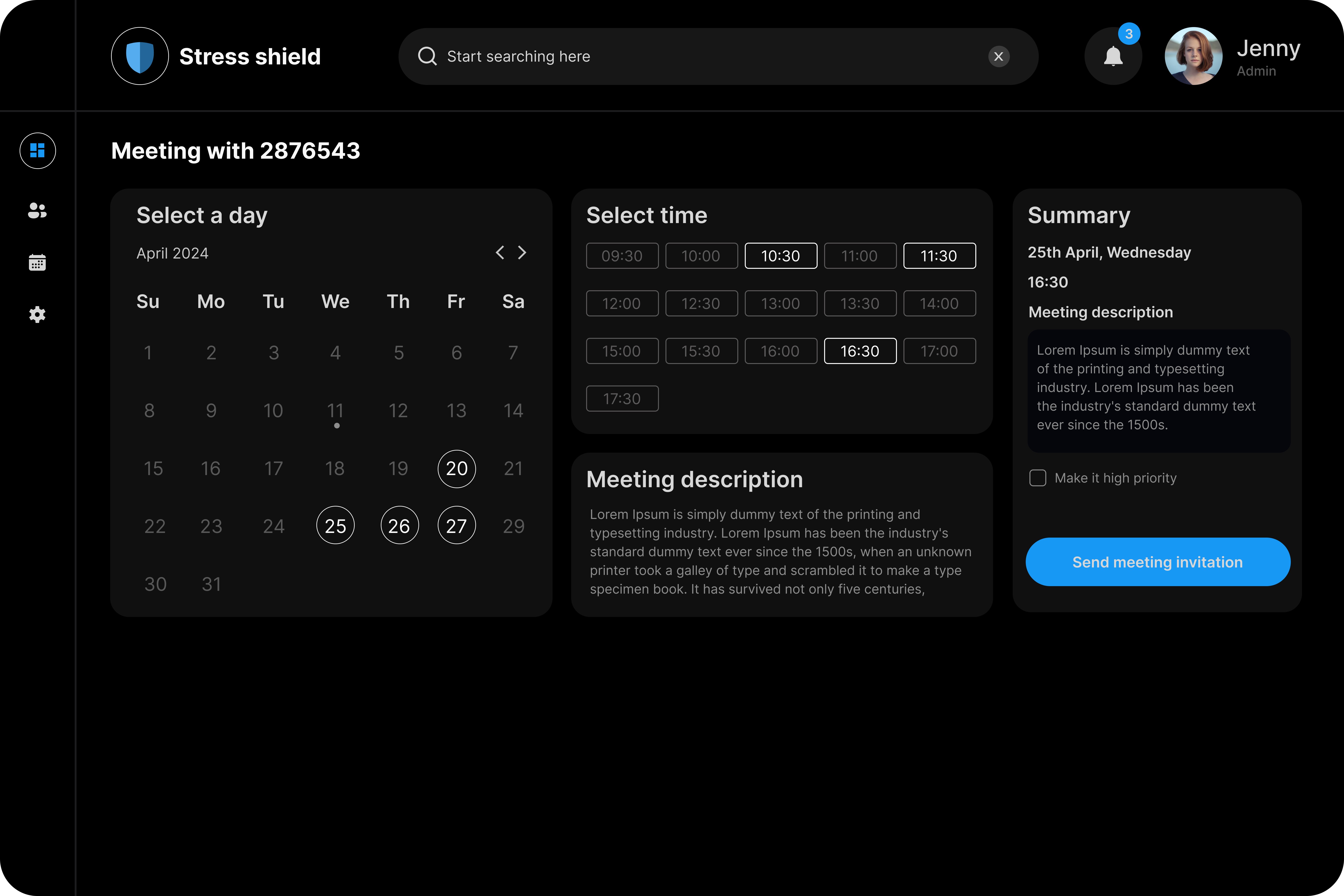
What broke
Removed names and photos — registration number only
What I changed
Added priority checkbox to scheduling flow
Wearable research - Empatica 4
We needed a wearable that students would actually wear. Wrist-based. Unobtrusive. Measures GSR and heart rate variability in real time. Data streams directly to the dashboard via Empatica cloud. We chose the wrist because it fits into an existing student behaviour like wearing a watch.

We designed this 3D wristband inspired by whoop and built it in Blender and Laser cutter
Key Learnings
Redefining the user was the most important design decision
Getting the primary user wrong would have made every screen useless. The pivot from teacher to admin unlocked the entire system.
Constraints produce better research
No real user to interview forced a smarter approach, which helped us find adjacent insights rather than guessing. That discipline carried through every decision.
Design for the referral, not the diagnosis.
Admins aren't clinicians. The moment we stopped designing for intervention and started designing for referral, the interface became simpler and more honest.
